waqasbaloch92
Pakistan

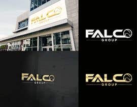
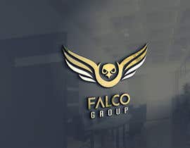
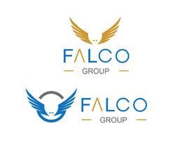
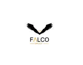
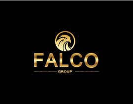
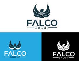
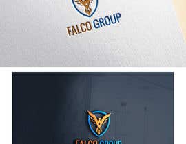
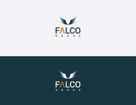
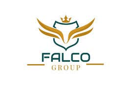
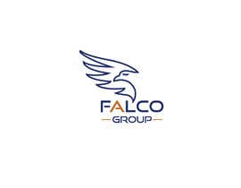
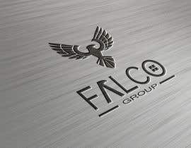
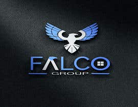
Redesign logo for real estate company. We have chosen to develop the logo with the gold color evokes ricquet and luxury. the gray blue represents the seriousness necessary to invest. the logo takes the wings of a hawk.
Attention watch the example attached to the project.
Details
art: symbol of hawk. (like wings in the example)
Color: gold, blue, grey
text: see example
“Great designer”
![]() zem120, Italy.
zem120, Italy.


あなたのコンテストを投稿 速くて簡単

たくさんのエントリーを集めましょう 世界中から

ベストエントリーをアワード ファイルをダウンロード - 簡単!