Logo redesign

  • ステータス: Closed
  • 賞金: $200
  • 受け取ったエントリー: 36

コンテスト概要

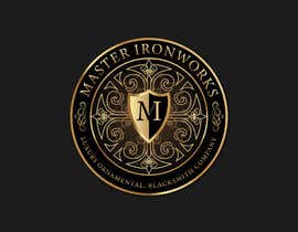
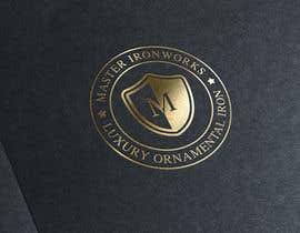
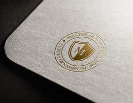
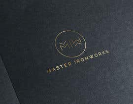
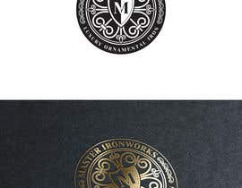
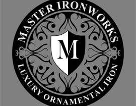
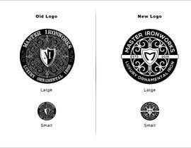
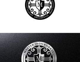
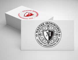
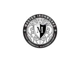
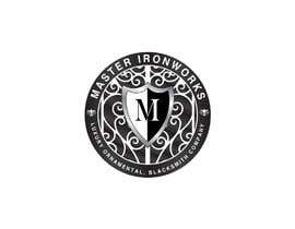
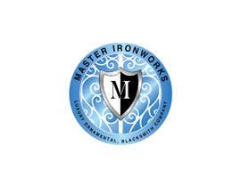
Master Ironworks (MIW) is a full service, luxury ornamental, blacksmith company. We artfully blend old-world, handcrafted ironwork & forgings with modern design technology on each custom project. Our original round business logo was designed 8 years ago, and just as the business has refined and established over the years, we now need our logo to reflect the same level of growth & professionalism. We would like to maintain the skeletal elements of the existing logo - round shape, color, center shield, filigree - but want to see it refined & cleaned up. We are open to a new copy on lettering (except the "M" in center shield) and optional decorative elements relative to MIW's brand identity. This logo will be used for all our media types (business cards, websites, social media) as well as construction gear (hard hats, safety vests, company vehicles) so we need it to be clean enough to be printed in both LARGE and small formats. We will require the winning logo to be saved in multiple file types, as well as multiple sizes of each type for immediate application.

推奨スキル

このコンテストのトップエントリー

エントリーをもっと表示

公開説明ボード

  • JIREH196
    JIREH196
    • 5年間前

    Please check #166 #167 #168 ...Thanks

    • 5年間前
  • mixoGFX
    mixoGFX
    • 5年間前

    There is another version of my design here https://drive.google.com/file/d/1LMvwxXrAj0fZravmikYDVopWdLXYrsP1/view?usp=sharing ....... I hope you see this one also.

    • 5年間前
  • JenicaIvy
    コンテスト所有者
    • 5年間前

    Nazim D. - thanks for asking. Just the "M" not MIW.

    • 5年間前
    1. mixoGFX
      mixoGFX
      • 5年間前

      Done at #112

      • 5年間前
    2. kdmpiccs
      kdmpiccs
      • 5年間前

      Ok sir.

      • 5年間前
  • JenicaIvy
    コンテスト所有者
    • 5年間前

    Thanks to everyone's entries so far. While some are well done, and considerable, we would like to clarify what we are looking for...

    We want to keep the logo in a ROUND CIRCLE format like the original logo. We do not want that to change. We would like to keep the shield with the "M" inside the logo. We are looking for the same logo style as the original, only cleaned up - something fresher. We are looking for decorative elements that represent the style of old-world ironwork, such as filigree, fleur de lis, etc. We are also looking to clean up the lettering, using a cleaner font. We are not looking for a totally new departure from the original. We hope this clarification helps.

    Please remember these files will need to be ready for both business cards, and larger applications for vehicles.

    • 5年間前
    1. kdmpiccs
      kdmpiccs
      • 5年間前

      are you want only M in shield or MIW?

      • 5年間前
    2. mixoGFX
      mixoGFX
      • 5年間前

      Done at #112

      • 5年間前
  • deginemorich111
    deginemorich111
    • 5年間前

    #95 #96

    • 5年間前
  • deginemorich111
    deginemorich111
    • 5年間前

    #24

    • 5年間前

コメントをもっと見る

コンテストの開始方法

  • あなたのコンテストを投稿

    あなたのコンテストを投稿 速くて簡単

  • たくさんのエントリーを集めましょう

    たくさんのエントリーを集めましょう 世界中から

  • ベストエントリーをアワード

    ベストエントリーをアワード ファイルをダウンロード - 簡単!

コンテストを今すぐ投稿 または本日参加!