Logo and Brand Identity Development

  • ステータス: Closed
  • 賞金: $111
  • 受け取ったエントリー: 8
  • 優勝者: nasironline791

コンテスト概要

We're looking for a designer with marketing experience who can help us with the look, feel and story for our precious jewelry brand.

Assets to be delivered after review of our current brand are as follows:

1. Logo Design and Branding Guide

Information:
Brand name: Western Opals
Tagline: none currently, open to ideas. We're also ok with no tagline

Current design and material: available at www.westernopals.com ...website design will change so you don't need to use current styles.

There are some articles in our blog that give you and idea of our story, background, etc.

Consumer target: we sell mid-level $25-$300 to high level $3000 max gemstones so our brand should reflect an exciting/fun/young but elegant image.

BONUS POINTS FOR:
1. Using 2019/2020 design trends such as variable or flat designs that can be animated: https://99designs.com/blog/trends/logo-design-trends-2019/
2. Logo should be fun/fresh and cutting edge but also elegant/mature
3. Business is based in Mexico, so if Mexican culture can be conveyed in a well-designed way that would be good. We really like https://dcassetcdn.com/design_img/3773136/810759/22875801/f0st5bv7svsh20m2eatfgbma1a_image.jpg
4. We like flat/matte/gradient logos when it comes to colors. Primary colors are gold, fuschia, aqua/teal. You can use 1 or all of these colors if done well. You can also view opals on our site for color inspiration

More on logo trends: https://www.canva.com/learn/biggest-logo-trends-2019/

推奨スキル

採用者フィードバック

“@nasironline791 won the contest on 14 November 2019”

プロフィール画像 kevinorin, United States.

このコンテストのトップエントリー

エントリーをもっと表示

公開説明ボード

  • kevinorin
    コンテスト所有者
    • 4年間前

    Thanks to everyone for submitting such great designs. At the moment 35, 76, 175 and 180 are top rated. 175 and 180 is the only ones to listen to our color directions regarding vibrant but pale gradient colors, detail in the symbol and geometric designs. Please revisit the reference links I posted in the project description as well as the project clarrification board.

    UPDATE TO DIRECTION.
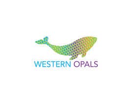
    Having a symbol with W or WO just reiterates the name. We'd like to see something totally different, such as a WHALE used for the icon using geometric design. The whale art can be simple geometry with gradient color but it needs to be original illustration, not stock or clipart. See this link for inspiratio only. https://imgur.com/a/sOGubpW

    The whale should be fun bud sophisticated like the man on the lion. Please submit a single image with your color, black on white and white on black versions so we can see all versatile appliciations of the logo in 1 submission.

    Thanks.

    • 4年間前
  • mamunmeaze50
    mamunmeaze50
    • 4年間前

    Please check #173 #174

    • 4年間前
  • nurnnabibd
    nurnnabibd
    • 4年間前

    Please check #171 +#170

    • 4年間前
  • nurnnabibd
    nurnnabibd
    • 4年間前

    Please check #171 +#170

    • 4年間前
  • kevinorin
    コンテスト所有者
    • 4年間前

    Gradient Design Inspiration: I like this overall but would like to see more diversity in fonts. Everyone is using the same fonts and proportions but I feel the graphic is too large on all of them.

    Would like to see a bit more complementary colors with gold besides just gold.

    Seee https://digitalsynopsis.com/design/beautiful-gradient-logo-designs/

    • 4年間前
    1. zubairsfc
      zubairsfc
      • 4年間前

      Please check #105 #106 waiting for feedback now

      • 4年間前
  • kevinorin
    コンテスト所有者
    • 4年間前

    Your logo should work on black, gray, white background colors.
    NOTE: This does not mean we want just black and white logos.

    • 4年間前
    1. pollobg
      pollobg
      • 4年間前

      ok sir thank you

      • 4年間前
  • kevinorin
    コンテスト所有者
    • 4年間前

    Thanks for the great designs. To save you all some time and give you some inspiration here are some notes.

    - Please submit logo views for websie applications. We do not need to see signage, textured backgrounds or stationery at this stage. Your logo should work on black, gray, white background colors.

    - The colors we like are as follows. You can use as many or as few of them as long as they work in the design and brand. Gold, Teal/Aqua, Coral, Fuscia or colors from opal stones on our website.

    - We like flat/matte/gradient logos. We do no like glossy or metallica logos. Also not a fan of dropshadows and bevels. They look outdated.

    - Using 2019/2020 design trends such as variable or flat designs is a + https://99designs.com/blog/trends/logo-design-trends-2019

    - Business is based in Mexico, so if Mexican culture can be conveyed in a well-designed way that would be good. We really like https://dcassetcdn.com/design_img/3773136/810759/22875801/f0st5bv7svsh20m2eatfgbma1a_image.jpg

    • 4年間前
  • riazuddin492749
    riazuddin492749
    • 4年間前

    #57

    • 4年間前
  • bristyislam1041
    bristyislam1041
    • 4年間前

    please check #31

    • 4年間前
  • noormohammedkhan
    noormohammedkhan
    • 4年間前

    please check #8, #21

    • 4年間前
  • mobarokhossenbd
    mobarokhossenbd
    • 4年間前

    hello

    • 4年間前

コメントをもっと見る

コンテストの開始方法

  • あなたのコンテストを投稿

    あなたのコンテストを投稿 速くて簡単

  • たくさんのエントリーを集めましょう

    たくさんのエントリーを集めましょう 世界中から

  • ベストエントリーをアワード

    ベストエントリーをアワード ファイルをダウンロード - 簡単!

コンテストを今すぐ投稿 または本日参加!