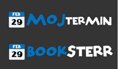
Logo Design for Appointment Scheduling page (Booksterr, MojTermin)
- ステータス: Closed
- 賞金: $140
- 受け取ったエントリー: 37
- 優勝者: razwanmohammed

コンテスト概要
I have a page design attached. And already two logos, which I don't 100% like. Both logos are for the same page, just different language. You can make the logo design same only text different or you can make different design for both logos. The current bookster logo I like especially the font. The problem of the mojtermin design is that the color don't match with the page design (the red blue don't agree).
As said you can upgrade the current logo desgins or make new ones..... All current design source attached.
P.S.: Don't make the logo design to much in height, it should still feed to current page layout.
推奨スキル
採用者フィードバック
“@razwanmohammed won the contest on 28 March 2013”
![]() gmatej1, Slovenia.
gmatej1, Slovenia.
公開説明ボード
-

razwanmohammed
- 11年間前
Thank you for choosing my design.
Razwan- 11年間前
-

badcom
- 11年間前
Congratz!!!
- 11年間前
-
badcom
- 11年間前
Please click my name and see private message I left thanks.
- 11年間前
-
razwanmohammed
- 11年間前
any updates?
- 11年間前
-

ImArtist
- 11年間前
Please check my entry. Thanks :)
- 11年間前
-

hirusanth
- 11年間前
please check #99 , #100 , #101
- 11年間前
-
badcom
- 11年間前
Hello gmatej1,
Any thoughts on #98. Also please check message with my entry. Thanks- 11年間前
-

ambrex
- 11年間前
What you think about my logo? :) Regards!
- 11年間前
-

himel605
- 11年間前
sir, please check my entry.
- 11年間前
-
razwanmohammed
- 11年間前
#59, made sterr more inline with the book and changed the date with 2 variations of different font that is more straight. if you let me know which 1 you prefer i can submit another with that.
- 11年間前
もう一つメッセージを見る
-
razwanmohammed
- 11年間前
sorry my mistake, i misunderstood. I've changed #63 with date and made booksterr same sime. I've also added #64 and #65 with different fonts for the main for you to have a look.
- 11年間前
-
razwanmohammed
- 11年間前
oh and i forgot #66 is same as #41 but with just date change.
- 11年間前
-
razwanmohammed
- 11年間前
Thank you for the ratings on #41 and #42. please do let me know if you require any modifications done.
- 11年間前
-

コンテスト所有者 - 11年間前
And booksterr, the "sterr" part poistion can be different then in "mojtermin". It can be more "inline". Maybe would look better? Mojtermin and Booksterr don't have to be 100% identical...
- 11年間前
-
razwanmohammed
- 11年間前
okay, i'll do that now and post back in a short while.
- 11年間前
-
himel605
- 11年間前
sir please check my Design thanks
- 11年間前
-
コンテスト所有者 - 11年間前
#34 I like the best so far. Could you add a version for MojTermin also (you define uperscae lowercase). And the book icon it should simbolize more a appointment - booking page (maybe replace with a calendar) not an book shop.
- 11年間前
-
himel605
- 11年間前
please see my new entry...
- 11年間前
-

litondtp
- 11年間前
plz the logo
- 11年間前
-

DesignSkilloz
- 11年間前
- 11年間前
-
コンテスト所有者 - 11年間前
Please look at attached images MojTermin, Booksterr for what I need for the page. You can make the same design for both logos, only text change. Or make separate design at wish.
- 11年間前
-
DesignSkilloz
- 11年間前
Working!
- 11年間前
-

kenzie90
- 11年間前
HI Kindly check no 1.I have done completely new design to reflect a simple yet catchy design that can connect instantly to the clients.World renowned logos are created the same way so as to portray a professional image to any audience
- 11年間前
-

designoneltd
- 11年間前
please check my Design #20 #21
- 11年間前
-
DesignSkilloz
- 11年間前
- 11年間前
-

ishanl
- 11年間前
check out #11 , I dint changed MOJTERMIN a lot , because its already looking good.
I changed Booksterr and i think its looking awesome :D- 11年間前
-
コンテスト所有者 - 11年間前
#8 something like that yes. But more refined... I think one "time" item is enough, if the icon then there is no need for the mini clocks in oo. #2 maybe a litlle to complex.
- 11年間前
-
razwanmohammed
- 11年間前
please see #8, i've kept it similar to what you had but change the colouring to fit in with the page.
- 11年間前
-
ishanl
- 11年間前
#4 #5 #6 are Exactly what you wanted.
Please rate it.
And if you want more things please leave a message here as there is still 1 week left.- 11年間前
-
DesignSkilloz
- 11年間前
#2
Idea can be improved if you like it.- 11年間前
-
kenzie90
- 11年間前
Hi kindly accept the attached images freelancer does not allow attahments in AI and photoshop format
- 11年間前
コンテストの開始方法
-

あなたのコンテストを投稿 速くて簡単
-

たくさんのエントリーを集めましょう 世界中から
-

ベストエントリーをアワード ファイルをダウンロード - 簡単!