フリーランサー:
jethtorres
OptionBerry Logo Study 1
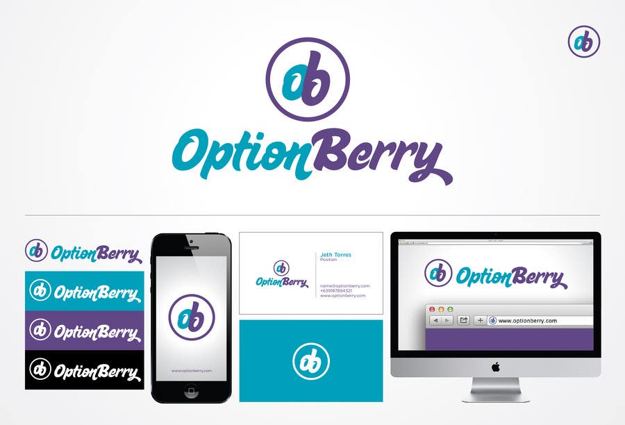
Fresh and alive are the words that best describe this logo design entry. The icon is made from the initials of the company, letters "o" and "b". Together, they formed a graphic rendition of a two-piece berry, and this two pieces represent the word "option". The wordmark or logotype used in this logo is a playful, active, fresh and alive typface to capture your desired meaning or look of your logo. Also, the icon (circular two-piece berry initials) is a stand-alone icon. It carries the brand's initials, meaning and official colors and can be used and applied into anything from print, to mobile and web.


