
Amlan2016
India

We are rebranding our company to be named as Open Source Solutions. We provide Open source and Linux solutions and services.
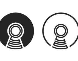
We already sketched the logo as you see in the attachment. It is a variation of the original Open Source Logo solution, while adding the letters OSS in the logo itself (if you notice, the O in the middle, and the 2 S letters), which is the abbreviation of our company name. What we want now is:
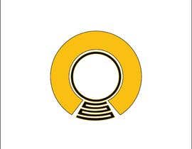
1) clean the logo to make it look better and sharper
2) enhance it (make coloring and structure to match the original Open Source logo)
3) simplify it. Avoid thin lines to make it clear in printing and small size logos ...etc.
4) Make it beautiful, and simple :-)
in other words, re-do the logo by making it matching the original Open Source logo as much as possible, while showing the OSS letters inside the logo. Fix colors and make it simple and beautiful.
What we are thinking of is: start from the original Open Source logo, add the OSS letters as in the sketch, and make it look beautiful and simple.
We also do not mind to see other variations around this logo too :-)
“Very quick response. Great and simple designs.”
![]() jodeci2000, Saudi Arabia.
jodeci2000, Saudi Arabia.


あなたのコンテストを投稿 速くて簡単

たくさんのエントリーを集めましょう 世界中から

ベストエントリーをアワード ファイルをダウンロード - 簡単!