sanjoy4371
Bangladesh

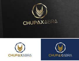
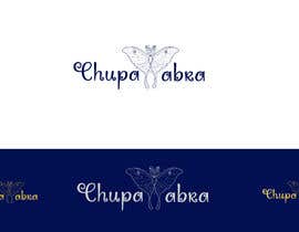
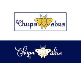
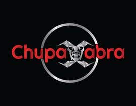
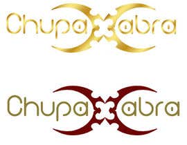
Hello. We need a logo and brand book (how to use logo and related colors) for the company. Name of the company is ChupaXabra.
HOW WE IMAGINE OUR LOGO:
- logo shall give the impression of the the good quality and high end products . However it shall not refer to any particular project.
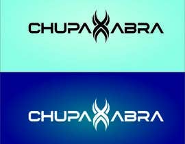
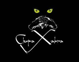
- logo shall highlight X letter. This letter could be (not nessecery) like letter "C" and the mirror reflection of this letter. Cause original word is Chupacabra.
- Logo shall somehow refer to the original word chupacabra (mythical beast appearing in the dark) but without putting obvious things like a head of some beast in front or in the end. One thing we were thinking about (as example but not need) letter X can be made like open moth showing the tooth of the beast.
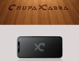
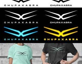
- The letter X shall be good enough to be use alone as a short version of the logo. In the place where the full chupaxabra can not be written we would like to use only that stylized X
- preferable use of classic color like, black, wood, silver, gold, dark blue, but you if you have some ideas how to use some more interesting colors (like neon blue, neon yellow) it is also very welcome. The most important logo shall give big impression of very good quality things.
- preferable use less different colors than more or make brand for normal use (like website) and then for printing on clothes with simplified color scheme.
One we will choose the logo (all possible variation accordingly to the brand book) shall be provided in vector format, PNG, PDF together with the brand book.
BRAND BOOK SHALL INCLUDE:
- full logo to be used in a dark color background
- full logo to be used in a bright color background
- X (short version uses) in the dark and white background
- Business card template (this is important to be a bit creative here and have not very standard cards)
- Paper blank template for documents (1st page and other pages)
Thank you in advance for your submissions. You can upload only logo first. This is a most important.
If we will have two or more preferences we will ask those people to show not only logo but how they imagine things in the brand book and then will choose the winner.
Thank you and looking forward for creative submissions.
“Very good designer, has proposed the best logo, also accepted to give few variations of the logo for us to have it for the use in the different coloring. Very nice communication and fast work. Highly recommended.”
![]() kwaidas, Luxembourg.
kwaidas, Luxembourg.


あなたのコンテストを投稿 速くて簡単

たくさんのエントリーを集めましょう 世界中から

ベストエントリーをアワード ファイルをダウンロード - 簡単!
